

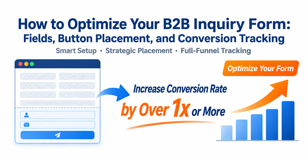
In the B2B export standalone-site conversion funnel, the inquiry form is the last mile between traffic and leads, and its design quality directly determines how efficiently visitors become qualified inquiries. Many companies blame low conversion rates on imprecise traffic while overlooking flaws in the form itself: redundant fields, hard-to-find entry points, and missing conversion tracking all drain potential customers. Optimizing form configuration in line with how users make decisions is the lowest-cost and most immediately effective way to lift conversions.
1. Form Design: The Critical Touchpoint in the Standalone-Site Conversion Funnel
Key takeaway: Poor field design is the primary reason for low form conversion rates on standalone sites. Many B2B sites lose more than half of their potential inquiries because the barrier to completing the form is too high.
Many B2B companies share a common misconception: the more fields a form has, the more complete the information collected and the higher the lead quality. As a result, they add numerous non-essential fields, such as budget, company size, job title, and full address, hoping to screen out high-intent customers in one step. The actual outcome is the opposite: the higher the barrier to completion, the more likely users are to abandon the form, and the fewer valid leads are ultimately submitted.
According to a sample of 120 industrial-manufacturing B2B export standalone sites analyzed by Xiamen First Page, sites with more than six form fields averaged a standalone-site form conversion rate of only 1.1%. Sites that limited the form to 3-4 required fields plus 2 optional fields averaged a conversion rate above 2.3%, a gap of more than double. Meanwhile, the difference in the share of valid inquiries between the two groups was under 5%, which shows that streamlining fields does not noticeably lower lead quality. It simply stops filtering out genuinely interested customers who abandon the form because it is too much trouble.
From the perspective of the full standalone-site design and development process, a form should be treated not merely as an information-collection tool but as a conversion gateway in the user's decision journey. The core principle is to minimize the barrier to completion while still allowing the sales team to follow up properly: retain the customer first, and gather further details gradually in subsequent communication.
2. Field Configuration Strategy: Criteria for Balancing Required and Optional Fields
Key takeaway: An inquiry form should follow the principle of "core information required, supporting information optional, non-essential information removed." Keep fields that are essential for follow-up, such as company and region, and remove sensitive items such as budget and company size, so that conversion rate and lead quality are both protected.
Many operators wonder which fields an inquiry form should include. In essence, the question is how to balance "conversion volume" against "lead quality." A well-layered field structure avoids losing customers to an excessive barrier while still giving the sales team enough information to follow up.
Inquiry Form Field Configuration Reference Table
| Field Category | Specific Fields | Configuration Rule | Core Purpose |
| Required | Name, company name, contact email, brief description of requirements | Mandatory; placed in the core area of the form | Ensures the sales team can follow up on the lead and understand the core business need |
| Recommended optional | City / region, WhatsApp number, company website | Not mandatory; placed in the lower half of the form | Helps assess lead quality and adds alternative contact channels |
| Not recommended | Specific purchasing budget, company headcount, job title, detailed company address | Remove from the initial form; collect in later communication | Lowers the barrier to completion and prevents users from abandoning the form over sensitive information |
This configuration logic is grounded in the B2B purchasing decision path: when a user first submits an inquiry, the core goal is to obtain product information and a quotation, and they are reluctant to disclose too much internal company information. Requiring sensitive details such as budget and company size will cause most low- to mid-intent customers to abandon the submission, whereas basic details such as name, company, and email are already enough for the sales team to complete the first round of contact and initial screening.
Service data from Xiamen First Page shows that after a form was streamlined from 7 required fields to a "4 required + 2 optional" structure, the number of valid inquiries rose by an average of 87%, while the share of spam and invalid inquiries increased by only 3%-5%, delivering a significant improvement in overall lead-generation efficiency. For companies concerned about lead quality, the length and professionalism of the requirements description can be used for initial screening, which is far more efficient than raising the barrier through additional fields.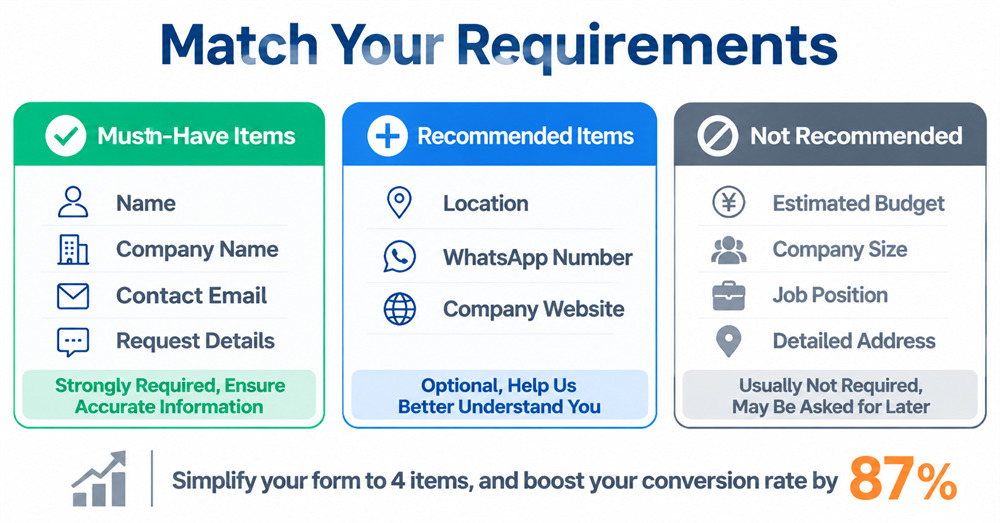
3. Entry Point Optimization: Inquiry Button Placement and Multi-Channel Configuration
Key takeaway: A well-planned entry point layout can increase inquiry volume by more than 30% without changing the fields. Deciding where to place inquiry buttons and how to configure a WhatsApp inquiry button is a key optimization item in standalone-site design.
On many sites, the inquiry entry point exists only on the Contact Us page, or as a small button at the bottom of the page, so users can barely find a way to reach out while browsing, and conversion rates naturally suffer. A layout with entry points in multiple positions and formats can meet users' inquiry needs at different stages of browsing and significantly increase the probability of conversion.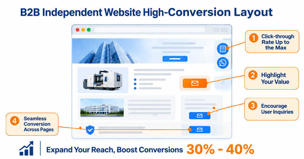
1. Key Placement Positions for Inquiry Buttons
Based on B2B users' browsing paths, inquiry buttons in the following four positions achieve the highest click-through and conversion rates:
· Global floating sidebar on the right: Fixed to the right side of the page and always within the user's field of view, this is the entry point with the highest click-through rate. We recommend placing both a "Submit Inquiry" button and a "WhatsApp Chat" button here to suit different communication preferences.
· Core area of the product detail page: The area to the right of the product specifications module and below the product description is where user interest peaks. A lightweight form or inquiry button placed here delivers the best conversion results.
· End of content pages and sidebars: At the end of and alongside blog posts, industry solution pages, and other content pages, users who develop a need after reading can reach out immediately. This is a good place for a customized form that matches the topic.
· Bottom of the certifications and About pages: After browsing company credentials and factory capabilities, users are in the trust-building stage, and an inquiry entry point here can effectively capture interested customers.
2. Key Points for Configuring the WhatsApp Inquiry Button
WhatsApp is an important communication channel for export standalone sites, particularly for users in markets such as Europe, Southeast Asia, and the Middle East. Pay attention to three details when configuring it:
First, avoid using an icon alone. Pair it with text such as "WhatsApp Chat" or "Instant Messaging" to reduce the cognitive load on users.
Second, configure a preset greeting so that clicking the button automatically sends an initial inquiry message about the relevant product. This reduces the effort required from users and improves response rates.
Third, place it alongside the form button rather than replacing the form entirely. B2B buyers in mature markets such as Europe and North America tend to prefer formal communication via email forms, while users in emerging markets prefer instant communication via WhatsApp. Offering both entry points covers a broader range of user groups.
Based on practical data, after multi-entry inquiry buttons are properly configured, overall inquiry volume can increase by 30%-40%, with the WhatsApp channel contributing 20%-30% of the additional valid inquiries.
4. Closing the Conversion Loop: Standardized Deployment of Conversion Code on the Thank-You Page
Key takeaway: The thank-you page shown after form submission is the core node for conversion tracking and an indispensable technical element of standalone-site development. Without properly deployed conversion code, ad platforms cannot learn the characteristics of real conversions, and targeting precision will fail to improve over the long term.
Many companies configure only a success pop-up after form submission, with no dedicated thank-you page and no conversion tracking code. This causes two problems. First, the ad platform can only count a "click on the form button" as a conversion, so accidental clicks and failed submissions are all recorded as conversions, severely inflating the data. Second, the ad model cannot identify the characteristics of users who actually complete a submission and can only optimize on click data, so accuracy declines the more you spend and the budget keeps being wasted.
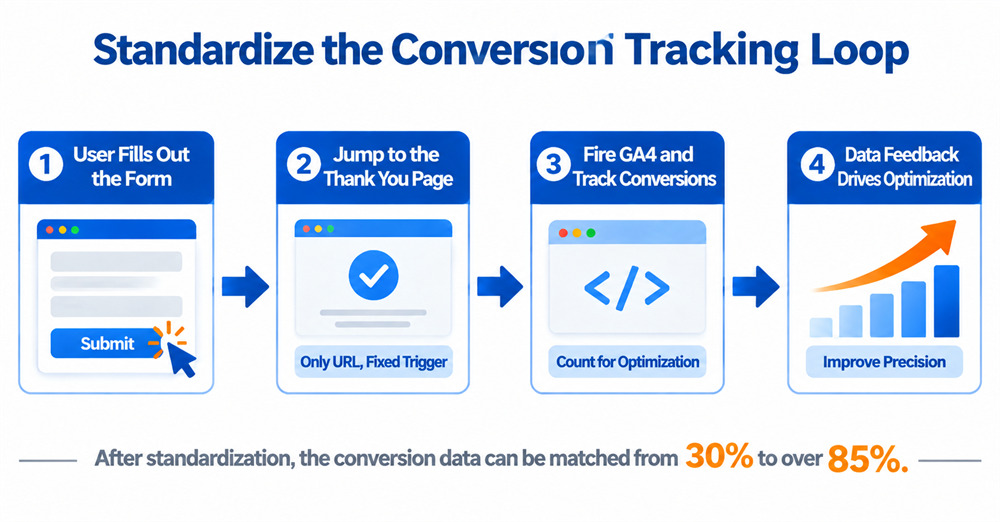
A correct conversion tracking setup should meet three standards:
1. Redirect to a dedicated thank-you page: After a successful form submission, users should always be redirected to a standalone thank-you page rather than shown only a pop-up. The thank-you page URL is unique and reliably triggers the conversion code, making it the most dependable method for counting conversions.
2. Standardized conversion code deployment: Use GTM to deploy the GA4 conversion event code and the Google Ads conversion code on the thank-you page, and mark successful form submissions as key conversion events. This step must be linked to the form fields to ensure that only users who submit successfully reach the thank-you page, which avoids invalid counts.
3. Extending the value of the thank-you page: Beyond confirming a successful submission, the thank-you page can offer recommended popular products, downloadable industry solutions, and contact information, which extends the user's time on site and encourages further browsing.
Under standalone-site development best practices, the thank-you page and conversion code should be configured before the site goes live rather than added afterward. Many companies only discover inaccurate data after ads are running, and then have to adjust the form structure and code configuration, wasting considerable testing budget and time. Service data from Xiamen First Page shows that after the thank-you page conversion code is properly deployed, the match rate between conversion data in the ad platform and real CRM inquiries can rise from around 30% to more than 85%, significantly improving the optimization efficiency of the ad model.
5. Real-World Validation: Conversion Gains from Full-Funnel Form Optimization
A B2B export standalone site for a machinery parts manufacturer in East China had a form with 7 required fields before optimization, including budget, company size, and job title. Inquiry entry points existed only on the Contact Us page and at the bottom of pages, and form submission triggered only a pop-up, with no dedicated thank-you page or conversion code configured. The site's standalone-site form conversion rate stayed at 0.9% for a long time, the number of conversions shown in the ad platform differed from real CRM inquiries by more than 3x, and advertising ROI remained persistently low.
The site then partnered with Xiamen First Page to complete a full-funnel form optimization:
1. Field restructuring: The form was streamlined to 4 required fields and 2 optional fields, removing non-essential fields such as budget and company size to lower the barrier to completion.
2. Entry point upgrade: A global floating dual-entry button on the right (form + WhatsApp) was added, an inquiry CTA was placed in the first screen of product detail pages, and lightweight forms were configured on content pages.
3. Technical calibration: A dedicated thank-you page was added, and GA4 and ad conversion code were deployed through GTM to calibrate how conversions are counted.
Three months after optimization, the site's core metrics improved significantly:
· The standalone-site form conversion rate rose from 0.9% to 2.1%, an increase of 133%.
· New inquiries from the WhatsApp channel accounted for 27% of the total, and total valid inquiries across the site increased by 128%.
· Conversion data accuracy rose from 32% to 89%, greatly improving the precision of the ad targeting model, and the cost per valid inquiry fell by 31%.
Inquiry conversion on a B2B standalone site has never been about "the more fields, the higher the quality." It is about capturing as many genuinely interested customers as possible at a reasonable barrier to entry. From the trade-offs in field configuration and the layout of inquiry entry points to the closed-loop deployment of conversion code, every detail affects final conversion efficiency.
As a Google Partner of Excellence for 11 consecutive years, Xiamen First Page brings 20 years of experience in foreign-trade digital marketing and has served more than 10,000 export companies in total. Across the full standalone-site design and development process, we stay focused on business conversion and optimize the entire form system, from field planning and entry point layout to conversion tracking, helping companies solve practical questions such as which fields an inquiry form should include, where to place inquiry buttons, and how to configure a WhatsApp inquiry button. This helps raise standalone-site form conversion rates and improve lead-generation efficiency. Call or WeChat us today: 18855144825.